Challenge
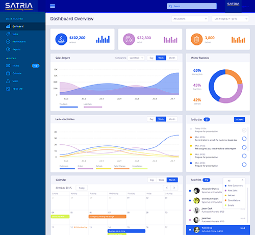
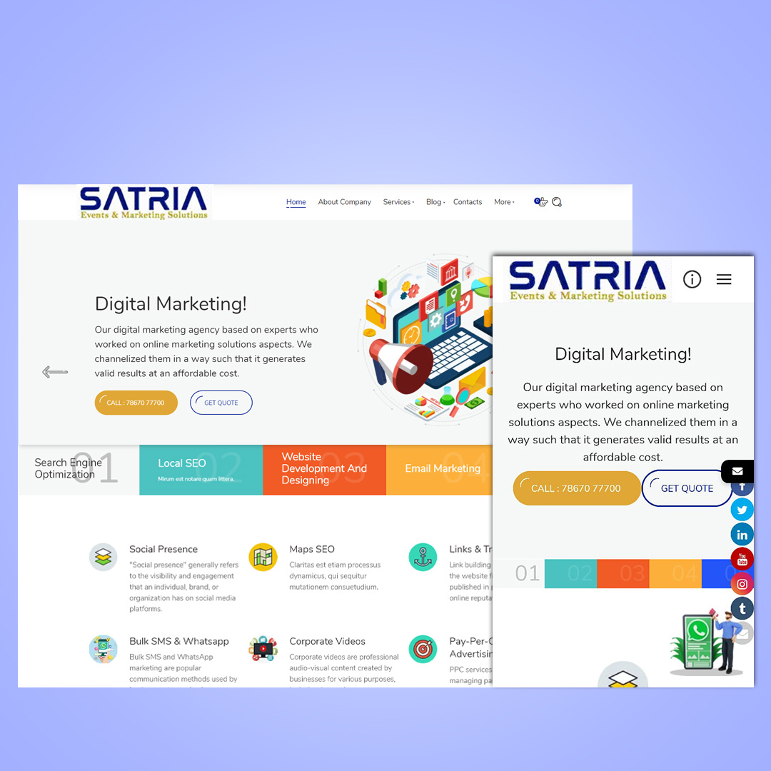
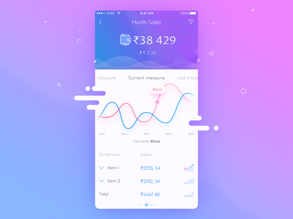
The optimization challenge for desktop and mobile websites revolves around creating a cohesive and user-friendly experience across various devices with distinct screen sizes, input methods, and browsing contexts.

Solution
The solution for optimizing desktop and mobile websites involves implementing responsive design techniques, prioritizing essential content for mobile users, simplifying navigation, optimizing performance, designing touch-friendly elements, serving adaptive images, conducting cross-device testing, and continuously improving based on feedback and evolving technologies.
This ensures a seamless user experience across devices, enhances engagement and improves overall website performance and accessibility.
The Result of Our Work
Our work in optimizing for both desktop and mobile devices has yielded impressive results. Users now enjoy a seamless browsing experience, regardless of the device they're using. With responsive design principles at the forefront, our website automatically adjusts its layout and content to fit the screen size, ensuring optimal viewing and interaction.
- Prioritizing essential content for mobile users has improved accessibility and engagement, as critical information is readily available even on smaller screens. Simplified navigation, including mobile-friendly menu designs and touch-friendly elements, has made it easier for users to find what they need quickly and intuitively.
- Optimizing performance has led to faster loading times, reducing bounce rates and improving user satisfaction. By serving adaptive images based on device specifications, we've minimized bandwidth usage without compromising on visual quality.
- Comprehensive cross-device testing has ensured compatibility across various browsers and devices, addressing any issues proactively. Continuous iteration based on user feedback and emerging technologies allows us to stay ahead of the curve, delivering an exceptional browsing experience that drives engagement and conversions.
- Overall, our efforts in optimizing for desktop and mobile have resulted in a user-centric website that caters to the diverse needs and preferences of our audience, ultimately enhancing our brand reputation and driving business growth.

0.09% CTR
20% less CPA
272% ROI


